
The following OpenType features are included in this font:
Disfranchisement
Circumstantiation
Newfoundlanders
Photosynthesizes
Overcapitalisation
Environmentalists
Joseph Niépce naît le 7 mars 1765 à Chalon-sur-Saône en Bourgogne sous le règne de Louis XV. Son père, Claude Niépce, conseiller du Roi, est avocat à la Cour, receveur des consignations à Chalon-sur-Saône et intendant du Duc de Rohan-Chabot qui le tenait en estime. Sa mère, née Claude Barault, est la fille d'Antoine Barault, avocat et conseiller du Roi. Très aisée et l'une des plus anciennes de Chalon, la famille Niépce possède des propriétés dispersées autour de la ville, procurant à Joseph des revenus élevés. Il adopte le surnom de Nicéphore selon certains lors de la période révolutionnaire; quand d'autres expliquent qu'il a choisi « Nicéphore » en 1787, mille ans après la fin du premier iconoclasme en 787, après avoir été renvoyé du lycée pour avoir montré des images de lanterne magique à sa classe.
The date of Niépce’s first photographic experiments is uncertain. He was led to them by his interest in the new art of lithography, for which he realized he lacked the necessary skill and artistic ability, and by his acquaintance with the camera obscura, a drawing aid which was popular among affluent dilettantes in the late 18th and early 19th centuries. The camera obscura’s beautiful but fleeting little “light paintings” inspired a number of people, including Thomas Wedgwood and Henry Fox Talbot, to seek some way of capturing them more easily and effectively than could be done by tracing over them with a pencil.
Letters to his sister-in-law around 1816 indicate that Niépce had managed to capture small camera images on paper coated with silver chloride, making him apparently the first to have any success at all in such an attempt, but the results were negatives, dark where they should be light and vice versa, and he could find no way to stop them from darkening all over when brought into the light for viewing. Niépce turned his attention to other substances that were affected by light, eventually concentrating on Bitumen of Judea, a naturally occurring asphalt that had been used for various purposes since ancient times. In Niépce’s time, it was used by artists as an acid-resistant coating on copper plates for making etchings. The artist scratched a drawing through the coating, then bathed the plate in acid to etch the exposed areas, then removed the coating with a solvent and used the plate to print ink copies of the drawing onto paper. What interested Niépce was the fact that the bitumen coating became less soluble after it had been left exposed to light.
Niépce dissolved bitumen in lavender oil, a solvent often used in varnishes, and thinly coated it onto a lithographic stone or a sheet of metal or glass. After the coating had dried, a test subject, typically an engraving printed on paper, was laid over the surface in close contact and the two were put out in direct sunlight. After sufficient exposure, the solvent could be used to rinse away only the unhardened bitumen that had been shielded from light by lines or dark areas in the test subject. The parts of the surface thus laid bare could then be etched with acid, or the remaining bitumen could serve as the water-repellent material in lithographic printing. Niépce called his process heliography, which literally means “sun drawing”. In 1822, he used it to create what is believed to have been the world’s first permanent photographic image, a contact-exposed copy of an engraving of Pope Pius VII, but it was later destroyed when Niépce attempted to make prints from it. The earliest surviving photographic artifacts by Niépce, made in 1825, are copies of a 17th-century engraving of a man with a horse and of what may be an etching or engraving of a woman with a spinning wheel. They are simply sheets of plain paper printed with ink in a printing press, like ordinary etchings, engravings, or lithographs, but the plates used to print them were created photographically by Niépce’s process rather than by laborious and inexact hand-engraving or drawing on lithographic stones. They thus are photo-etchings. One example of the print of the man with a horse and two examples of the print of the woman with the spinning wheel are known to have survived. The former is in the collection of the Bibliothèque nationale de France in Paris and the latter two are in a private collection in Westport, Connecticut.
Informations
aalt
calt
case
ccmp
cpsp
dnom
frac
hist
kern
liga
lnum
locl
numr
onum
ordn
pnum
sinf
ss01
ss02
ss03
ss04
ss05
ss06
ss07
ss08
ss09
ss10
ss11
ss12
subs
sups
tnum
zero
- LIGHT SS07Alternative “G”
- QUEST SS09Alternative “Q”
- ART SS10Alternative “R”
- plate SS05Alternative “t”
- copy SS06Alternative “y”
Glyphset
A
Uppercases
A
B
C
D
E
F
G
H
I
J
K
L
M
N
O
P
Q
R
S
T
U
V
W
X
Y
Z
Lowercases
a
b
c
d
e
f
g
h
i
j
k
l
m
n
o
p
q
r
s
t
u
v
w
x
y
z
Accented Uppercases
À
Á
Â
Ã
Ä
Ā
Ă
Å
Ǻ
Ą
Æ
Ǽ
Ć
Ĉ
Č
Ċ
Ç
Ď
Đ
È
É
Ê
Ẽ
Ě
Ë
Ē
Ĕ
Ė
Ę
Ĝ
Ǧ
Ḡ
Ğ
Ġ
Ģ
Ĥ
Ħ
Ì
Í
Î
Ĩ
Ï
Ī
Ĭ
İ
Į
IJ
Ĵ
Ķ
Ĺ
Ľ
Ļ
Ł
Ŀ
Ń
Ň
Ñ
Ņ
Ò
Ó
Ô
Õ
Ö
Ō
Ŏ
Ő
Ǫ
Ø
Ǿ
Œ
Ŕ
Ř
Ŗ
ẞ
Ś
Ŝ
Š
Ş
Ș
Ť
Ț
Ţ
Ŧ
Ù
Ú
Û
Ũ
Ü
Ū
Ŭ
Ů
Ű
Ų
Ẁ
Ẃ
Ŵ
Ẅ
Ỳ
Ý
Ŷ
Ỹ
Ÿ
Ȳ
Ź
Ž
Ż
Ə
Ɲ
Ŋ
Ð
Þ
DŽ
Dž
LJ
Lj
NJ
Nj
Accented Lowercases
à
á
â
ã
ä
ā
ă
å
ǻ
ą
æ
ǽ
ć
ĉ
č
ċ
ç
ď
đ
è
é
ê
ẽ
ě
ë
ē
ĕ
ė
ę
ĝ
ǧ
ḡ
ğ
ġ
ģ
ĥ
ħ
ì
í
î
ĩ
ï
ī
ĭ
i
į
ı
ij
ĵ
ȷ
ķ
ĺ
ľ
ļ
ł
ŀ
ń
ň
ñ
ʼn
ņ
ò
ó
ô
õ
ö
ō
ŏ
ő
ǫ
ø
ǿ
œ
ŕ
ř
ŗ
ś
ŝ
š
ş
ș
ß
ť
ț
ţ
ŧ
ù
ú
û
ũ
ü
ū
ŭ
ů
ű
ų
ẁ
ẃ
ŵ
ẅ
ỳ
ý
ŷ
ỹ
ÿ
ȳ
ź
ž
ż
ə
ɲ
ŋ
ð
þ
dž
lj
nj
Alternates
G
Ĝ
Ǧ
Ḡ
Ğ
Ġ
Ģ
J
IJ
Ĵ
LJ
NJ
Q
R
Ŕ
Ř
Ŗ
a
à
á
â
ã
ä
ā
ă
å
ǻ
ą
æ
ǽ
g
ĝ
ǧ
ḡ
ğ
ġ
ģ
j
ij
lj
nj
t
ť
ț
ţ
ŧ
ť
ț
ţ
ŧ
y
ỳ
ý
ŷ
ỹ
ÿ
ȳ
Ligatures
Th
ſ
ff
fi
ffi
fj
ffj
fl
ffl
ft
fft
tt
ft
fft
tt
Diacritics
́
̋
̂
̌
̆
̊
̇
̈
̃
̄
·
·
̀
́
̋
̂
̌
̆
̊
̇
̈
̃
̄
̒
̦
̧
̨
Lining figures and currencies
#
0
1
2
3
4
5
6
7
8
9
€
$
₿
¢
£
₺
ƒ
¥
₸
฿
₴
₽
₹
₪
₩
₫
Old style figures and currencies
#
0
1
2
3
4
5
6
7
8
9
€
$
₿
¢
£
₺
ƒ
¥
₸
฿
₴
₽
₹
₪
₩
₫
Tabular figures and currencies
#
0
1
2
3
4
5
6
7
8
9
€
$
₿
¢
£
₺
ƒ
¥
₸
฿
₴
₽
₹
₪
₩
₫
Tabular old style figures and currencies
#
0
1
2
3
4
5
6
7
8
9
€
$
₿
¢
£
₺
ƒ
¥
₸
฿
₴
₽
₹
₪
₩
₫
Slashed Zeros
0
Mathematical symbols
+
−
±
×
÷
=
≠
~
≈
^
¬
⌀
¤
<
>
≤
≥
∞
◊
Δ
Ω
∂
∫
√
∑
∏
π
μ
°
ℓ
℮
〈
〉
【
】
「
」
《
》
〔
〕
〖
〗
『
』
Case sensitive mathematical symbols
+
−
×
÷
=
≠
~
≈
¬
<
>
Superior figures
,
.
(
)
+
−
×
÷
=
0
1
2
3
4
5
6
7
8
9
Inferior figures
,
.
(
)
+
−
×
÷
=
0
1
2
3
4
5
6
7
8
9
Numerators
,
.
(
)
+
−
×
÷
=
0
1
2
3
4
5
6
7
8
9
Denominators
,
.
(
)
+
−
×
÷
=
0
1
2
3
4
5
6
7
8
9
Open circled figures
0
1
2
3
4
5
6
7
8
9
10
Close circled figures
0
1
2
3
4
5
6
7
8
9
10
Fractions
⁄
%
‰
¼
½
¾
⅛
⅜
⅝
⅞
Roman figures
Ⅰ
Ⅱ
Ⅲ
Ⅳ
Ⅴ
Ⅵ
Ⅶ
Ⅷ
Ⅸ
Ⅼ
Ⅽ
Ⅾ
Ⅿ
Standard punctuation
,
;
:
.
…
-
!
¡
?
¿
‽
⸮
@
‘
’
“
”
‚
„
‘
“
‹
›
«
»
&
/
\
|
¦
_
–
—
•
·
(
)
[
]
{
}
*
⁂
†
‡
§
¶
Case sensitive punctuation
-
–
—
·
‹
›
«
»
(
)
[
]
{
}
¡
¿
@
Abbreviations
℃
℉
℀
℁
℆
℅
©
℗
®
™
℠
ª
º
№
Geometrical symbols
■
□
◆
◇
●
○
◧
◨
⬒
⬓
◩
⬔
⬕
◪
⬖
⬗
⬘
⬙
◐
◑
◓
◒
◀
▶
▲
▼
◁
▷
△
▽
◂
▸
▴
▾
◃
▹
▵
▿
⏏
⏪
⏩
⏫
⏬
⏮
⏭
⏯
⏸
⏹
⏺
Miscellaneous symbols
✴
✳
✺
☀
☼
☽
☾
⚡
☁
⚙
♀
♂
⚲
⚫
⚪
◉
◎
🔍
🔎
🔒
🔓
≡
❌
⌘
♥
♡
⚑
⚐
★
☆
❤
♠
♣
♦
✓
✗
☐
☑
☒
❏
❍
◌
Arrows
←
↑
→
↓
↖
↗
↘
↙
↔
↕
➤
➣
➢
↰
↱
↲
↳
⬑
⬏
⬐
⬎
⭰
⭲
⭱
⭳
ꜜ
🔀
🔁
🔂
⮀
⮂
⮁
⮃
⮌
⮎
⮏
⮍
🔃
🔄
⟳
⟲
Languages
Abenaki, Afaan Oromo, Afar, Afrikaans, Albanian, Alsatian, Amis, Anuta, Aragonese, Aranese, Aromanian, Arrernte, Arvanitic, Asturian, Atayal, Aymara, Azerbaijani, Bashkir, Basque, Belarusian, Bemba, Bikol, Bislama, Bosnian, Breton, Cape Verdean Creole, Catalan, Cebuano, Chamorro, Chavacano, Chichewa, Chickasaw, Cimbrian, Cofán, Cornish, Corsican, Creek, Crimean Tatar, Croatian, Czech, Danish, Dawan, Delaware, Dholuo, Drehu, Dutch, English, Esperanto, Estonian, Faroese, Fijian, Filipino, Finnish, Folkspraak, French, Frisian, Friulian, Gagauz, Galician, Ganda, Genoese, German, Gikuyu, Gooniyandi, Greenlandic, Guadeloupean Creole, Gwich'in, Haitian Creole, Hän, Hawaiian, Hiligaynon, Hopi, Hotcąk, Hungarian, Icelandic, Ido, Igbo, Ilocano, Indonesian, Interglossa, Interlingua, Irish, Istro-Romanian, Italian, Jamaican, Javanese, Jèrriais, Kaingang, Kala Lagaw Ya, Kapampangan, Kaqchikel, Karakalpak, Karelian, Kashubian, Kikongo, Kinyarwanda, Kiribati, Kirundi, Klingon, Kurdish, Ladin, Latin, Latino sine Flexione, Latvian, Lithuanian, Lojban, Lombard, Low Saxon, Luxembourgish, Maasai, Makhuwa, Malay, Maltese, Manx, Māori, Marquesan, Megleno-Romanian, Meriam Mir, Mirandese, Mohawk, Moldovan, Montagnais, Montenegrin, Murrinh-Patha, Nagamese Creole, Nahuatl, Ndebele, Neapolitan, Ngiyambaa, Niuean, Noongar, Norwegian, Novial, Occidental, Occitan, Old Icelandic, Old Norse, Onĕipŏt, Oshiwambo, Ossetian, Palauan, Papiamento, Piedmontese, Polish, Portuguese, Potawatomi, Q'eqchi', Quechua, Rarotongan, Romanian, Romansh, Rotokas, Sami, Samoan, Sango, Saramaccan, Sardinian, Scottish Gaelic, Serbian, Seri, Seychellois Creole, Shawnee, Shona, Sicilian, Silesian, Slovak, Slovenian, Slovio, Somali, Sorbian, Sotho, Spanish, Sranan, Sundanese, Swahili, Swazi, Swedish, Tagalog, Tahitian, Tetum, Tok Pisin, Tokelauan, Tongan, Tshiluba, Tsonga, Tswana, Tumbuka, Turkish, Turkmen, Tuvaluan, Tzotzil, Uzbek, Venetian, Vepsian, Volapük, Võro, Wallisian, Walloon, Waray-Waray, Warlpiri, Wayuu, Welsh, Wik-Mungkan, Wiradjuri, Wolof, Xavante, Xhosa, Yapese, Yindjibarndi, Zapotec, Zarma, Zazaki, Zulu, Zuni
About
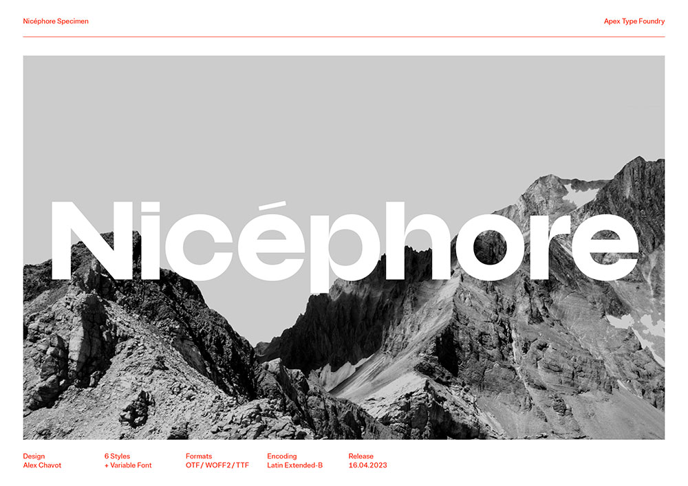
Drawing influence and mood from phototypesetting-era sans-serif fonts (notably Brasilia by Albert Hollenstein and Albert Boton, 1958–60), Nicéphore is a quiet guy in disguise. Look again and you’ll probably notice its highly contrasted joints, solid feel, and surprising letter shapes.
The Nicéphore family is a variable font exploration of the “multiplexing” principle: each of its six styles is drawn on the same width, allowing you to change weight on the fly without disrupting the layout. A perfect choice for smooth rollover effects on the web, type animations… you name it!
Nicéphore takes a very unconventional approach to width and weight distribution by keeping the former constant while increasing the latter. The unsettling result is a striking display typeface with a monumental x‑height, very short ascenders and descenders, and unobtrusive diacritics
—all specifically meant for compact line spacing and dense page texture.
Its tight letter-spacing contrasts with an otherwise quite extended overall letterform design, equipping Nicéphore with a special power to stand out from the crowd. As with every Apex typeface, it is packed with numerous stylistic sets and alternates, providing typesetters with even more options to tweak the voice and feeling of any piece of text.
Download PDF
You may also like


 View all