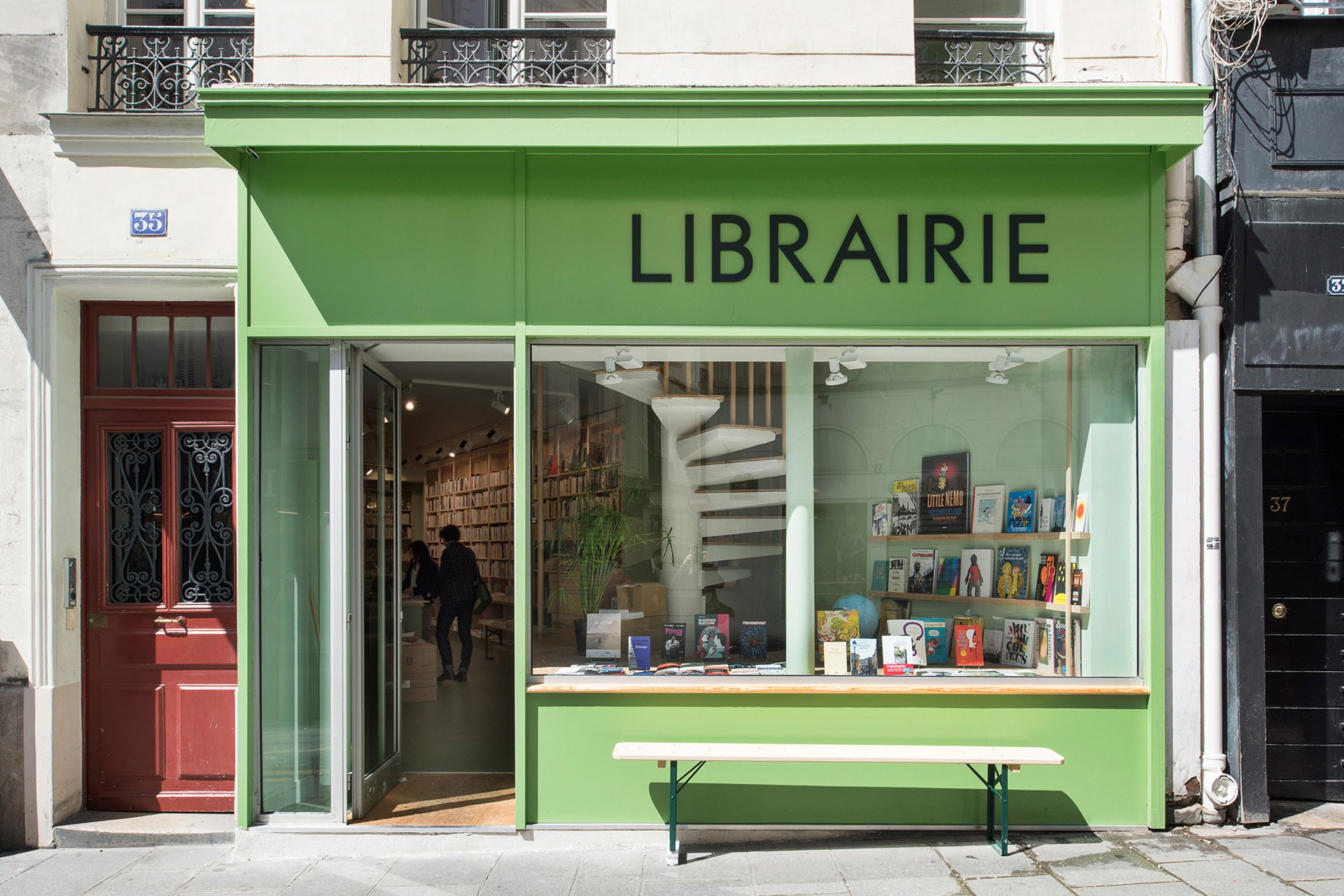
In 2016, Paris-based design studio deValence was commissioned to develop the visual identity and signage for Petite Égypte, an independent bookshop located in a Paris neighborhood shaped by streets such as rue du Caire, rue d’Aboukir and rue du Nil—an urban triangle long nicknamed “Little Egypt.” The geographical context naturally called for a typographic voice with both character and historical depth.
Around that time, deValence had come across an Intertype specimen featuring Vogue, a sans-serif, all-caps typeface originally cut by Stephenson Blake in 1929. Designed for Vogue magazine (Condé Nast) before being released to the wider printing trade, it later became a distinctive alternative to Futura, with slightly idiosyncratic proportions and a less doctrinaire geometry. A light and bold adaptation was produced by Intertype in the early 1930s. Intrigued by its personality, the studio entrusted me with the development of a custom reinterpretation.


What began as a revival quickly evolved into something more autonomous. Renamed Nil, the typeface was carefully modernized: the regular weight was made slightly bolder, the x-height increased, and ascenders and descenders shortened to create a more compact and assertive rhythm. Particular attention was paid to alternate glyphs and to amplifying the subtle eccentricities of the original design—moving away from a strict, rationalist Futura model toward a warmer, less conservative presence suited to the bookshop’s identity.


Nil became the typographic backbone of Petite Égypte, extending across signage, logotype, website, and even a beer label. Initially conceived as a single style, it grew over time into a broader family with multiple weights and an italic companion. Since then, Nil has become a recurring typeface within deValence’s practice, flourishing across diverse projects—from institutional identities to book covers, posters, and exhibition graphics—affirming its evolution from contextual revival to versatile contemporary workhorse.


