For many years, Paris-based design studio deValence has been using Le Plus Grand—a typeface of their own creation—for editorial and cultural projects, including the earliest titles of French artist Raphaël Zarka’s influential books on skateboard culture published by Éditions B42.


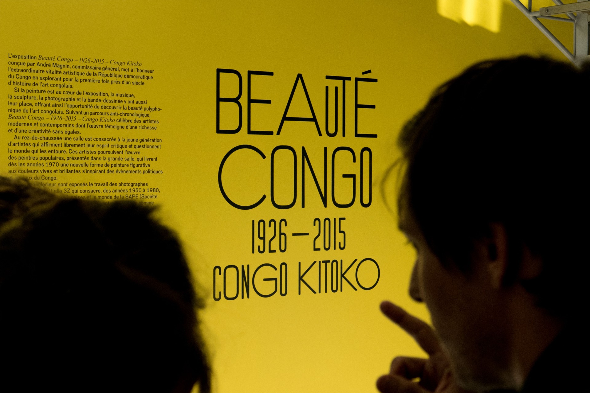
In 2014, as part of the Beauté Congo | Congo Kitoko exhibition at the Fondation Cartier pour l’art contemporain in Paris—a major survey tracing nearly a century of artistic production from the Democratic Republic of the Congo—deValence invited me to rework Le Plus Grand into a lighter, more expressive version to shape the exhibition’s visual identity across signage, communication, and the catalog.


This commission became an opportunity to completely rethink the typeface, transforming the original all-caps, rounded sans serif into a versatile new display system for the studio. We imagined three distinct widths within a single variable font—each usable independently or randomly applied—and enriched it with a comprehensive set of playful ligatures, expanding its expressive capacity for headlines and typographic compositions.
In addition, LePlus includes a full set of easy-to-use underlined and overlined alphabets enabled through OpenType features, specifically designed to animate typographic hierarchies with energetic, layered effects.


Le Plus grew further in 2018 with the 16th International Architecture Exhibition of La Biennale di Venezia, for which architects Encore Heureux were selected to curate the French Pavilion (“Lieux Infinis”), celebrating inventive architectural projects across France.
For this occasion, we expanded LePlus into a five-style family—from Light to Heavy—packed with numerous alternates and ligatures. All five styles were deployed throughout the pavilion’s graphic program: posters, signage, editorial materials, and the pavilion catalog, reinforcing a coherent yet richly textured typographic voice.


