For the reopening of the Maison de La Vache qui rit’s brand museum, French design studio deValence was invited by Encore Heureux, architects of the project, to develop the museum’s new visual identity, communication system, and signage. Immersed in nearly a century of archives—ranging from printed matter and packaging to advertisements, objects, and ephemera—the studio uncovered a remarkably rich typographic heritage that would become the foundation of the project.


From this research emerged MVQR, a bespoke typeface conceived as both a synthesis and a contemporary reinterpretation of the brand’s graphic history. Rather than reproducing a specific historical model, MVQR distills recurring formal traits found across decades of communication, transforming them into a coherent typographic voice for the museum.


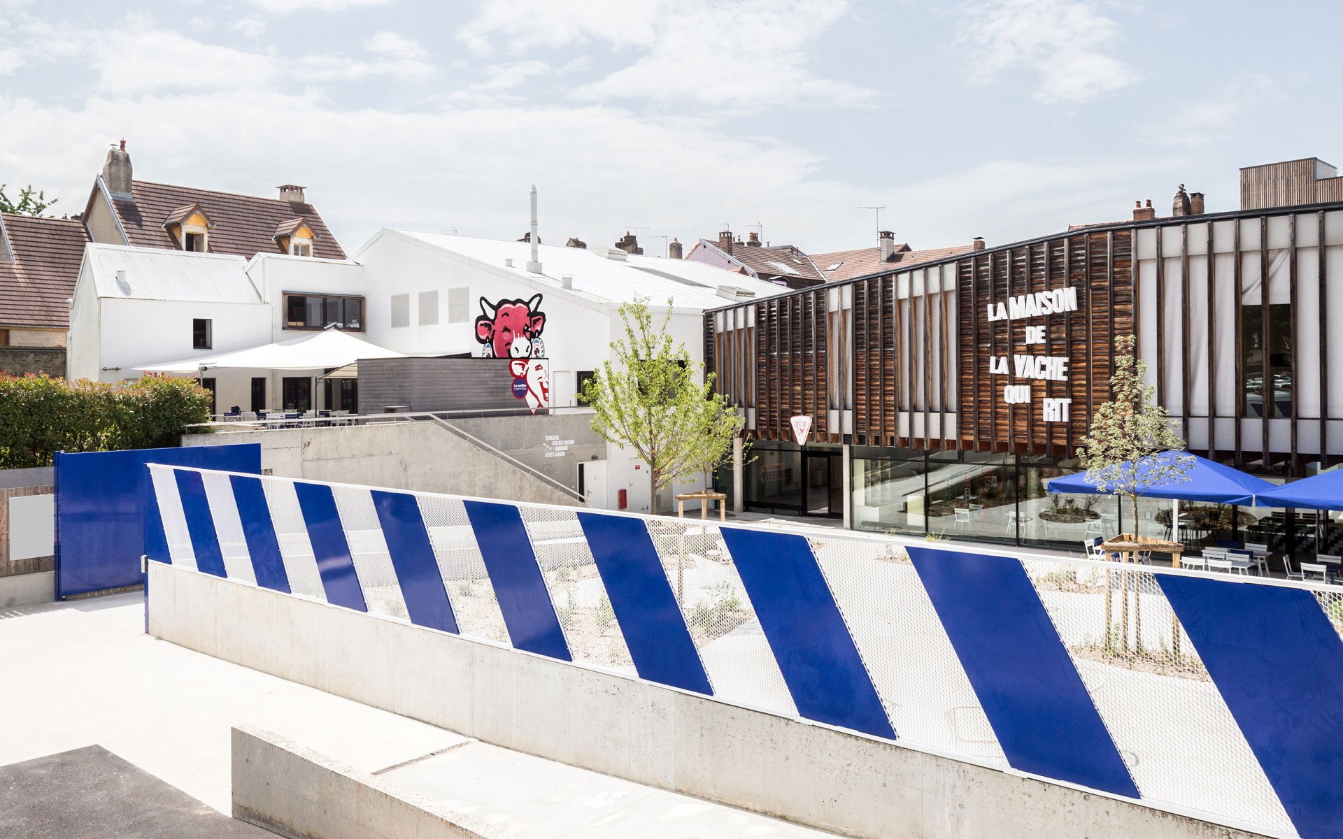
Rooted in the expressive vernacular of late 19th- and early 20th-century printing woodblocks, the typeface embraces sturdy proportions, compact rhythms, and a certain handcrafted vitality. Its most distinctive feature lies in a unique set of vertically centered small caps, specifically designed to compose lively, tightly structured headlines. This unconventional positioning subtly disrupts typographic expectations, generating a playful tension that echoes the brand’s iconic spirit.
Balancing archival memory with contemporary clarity, MVQR plays a central role in the museum’s renewed identity. It bridges heritage and present-day expression, ensuring that the voice of La Vache qui rit remains as vibrant, bold, and unmistakable as ever.


