In 2021, at the invitation of the Paris-based architects Encore Heureux, the design studio deValence was commissioned to develop the visual identity and signage for the new Véo cinema in Colomiers—the Grand Central. At the heart of the project lies the creation of a bespoke typeface: Grand Central Mono.

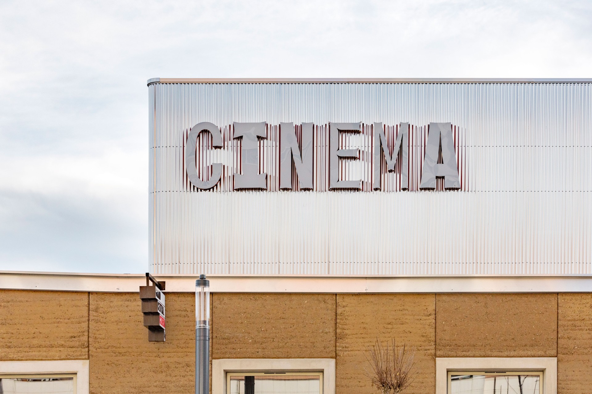
Grand Central is a monospaced variable typeface that revisits the formal legacy of “light traps” from the era of phototypesetting. At that time, letterforms were deliberately distorted to compensate for the optical degradation caused by light projection. Shapes were subtly adjusted, and corners strategically altered (with little “spikes”) to preserve clarity once enlarged and illuminated. This technical heritage becomes here both a conceptual reference and a visual language.


Through its variable axis, Grand Central Mono plays with different weights and degrees of deformation. On the monumental CINEMA sign, these shifting forms create a dynamic, almost kinetic presence—letters appearing to stretch, absorb, or resist light. The playful instability of the display styles contrasts with a more stable, heavier cut designed to carry information with authority and precision. This steadier version structures the entire signage system, from directional panels and room numbers to the café menus.


In 2025, the identity expanded once again with the opening of a new venue in Toulouse, in the Cartoucherie district, designed by Compagnie Architecture. Grand Central Mono continues to define the cinema’s visual voice, bridging architectural scale and typographic experimentation while reaffirming the project’s distinctive graphic presence.


