Apex Type Foundry

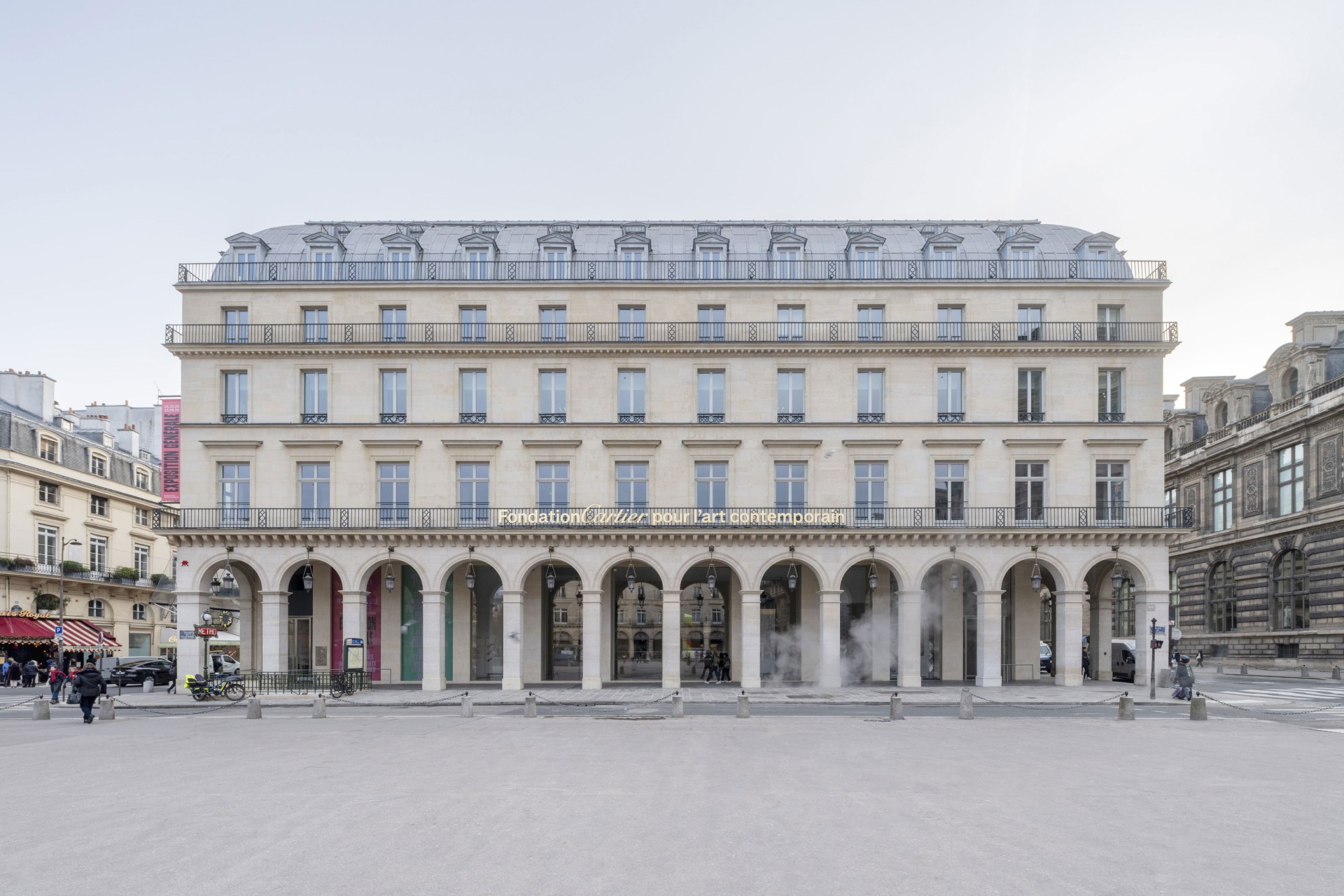
Apex Type Foundry collaborated with Paris-based studio deValence on the new visual identity of the Fondation Cartier pour l’art contemporain, developed on the occasion of the institution’s move to its new building at the Palais-Royal.


At the heart of the identity sits Fondation, a bespoke typeface drawn by Apex Type Foundry together with deValence. Its defining feature is its beveled terminals, derived from the angle of the Cartier typogram—a detail that ties the typeface directly to the institution’s heritage while giving it a distinct, contemporary voice.

Photos © deValence

Fondation was designed in 5 weights, each with a companion italic, providing the full range of typographic tools needed to serve an identity at this scale. From editorial layouts to environmental signage, the typeface operates as the primary graphic instrument across all touchpoints.

Photos © Martin Argyroglo

Alongside the typeface, over 250 original pictograms were drawn by Camille Lemoine at deValence in the same visual language, extending the typographic system into wayfinding and communication. In the signage of the new Palais-Royal building, Fondation is used in a single weight—a deliberate choice that reinforces the graphic vocabulary established by the logotype and ensures visual continuity throughout the space.

We also took the opportunity of the first exhibition Exposition Générale, to design a titling typeface to accompany the Fondation’s first steps.

Discover more case studies