
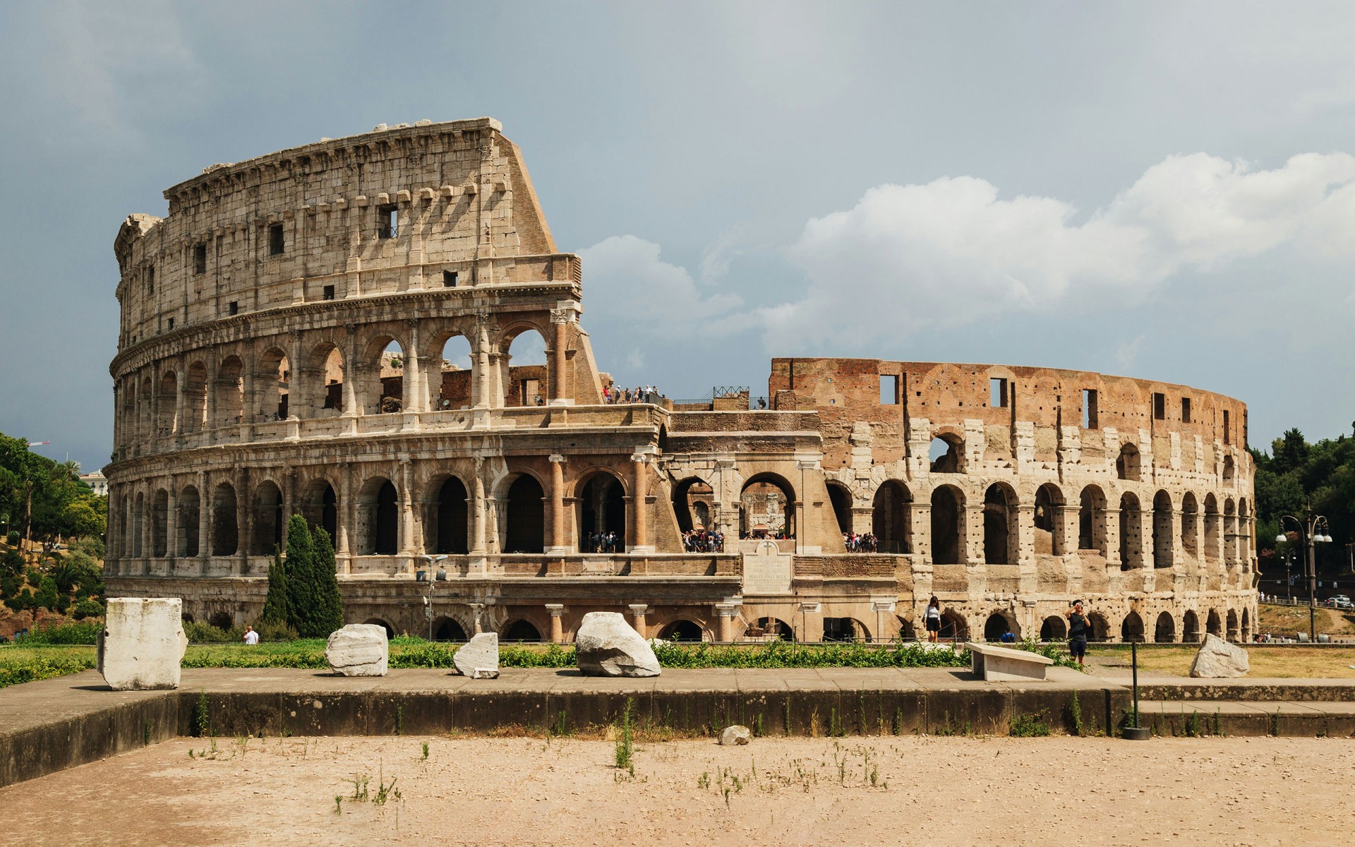
French design studio deValence was commissioned to create a series of visual assets for the merchandising range of the Colosseum in Rome. Recognizing a unique chance to reflect the monument’s profound historical presence, they proposed the development of a custom typeface that could channel the architectural gravitas and cultural resonance of the site in dialogue with a playful set of drawings by French illustrator Jeremy Perrodeau. Colosseo was born from this dialogue between past and present—an all-caps typeface rooted in the tradition of Roman stone-carved lettering yet reimagined for contemporary visual expression.


Drawing inspiration from the monumental inscriptions etched into ancient travertine, Colosseo signals its lineage through robust, flared strokes that evoke the subtle irregularities of chisel and hammer. The letterforms carry a tactile, roughened texture that conjures stone and age, yet they avoid the oppressive strictness often associated with classical revival typefaces. Instead, the design strikes a balance: reverent without being rigid, historic without being nostalgic.


Thoughtfully crafted for display use, Colosseo includes a rich set of historical ligatures and alternate forms that expand its expressive range. These contextual glyphs do more than embellish— they animate the type, infusing it with a lively, almost celebratory character that complements the Colosseum’s dramatic silhouette and enduring public appeal.
Ultimately, Colosseo is more than a typographic nod to antiquity; it is a custom identity tool that harmonizes architectural heritage with modern graphic storytelling, giving voice to one of the world’s most iconic monuments in a way that feels both rooted and refreshingly alive.

